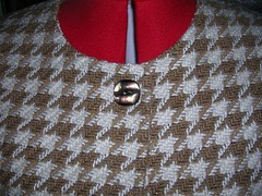
Here they are again, pinned on to the neck of the jackette.
First the shiny brown.

Next, the large gold.
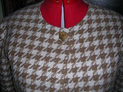
Then the smaller gold.
I suppose I could make the largest size of buttonhole and then switch out the buttons from time to time. More votes!
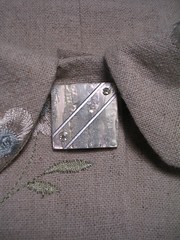
Speaking of buttons, I finally got some for the embroidered linen. It was a tough contest at the store, with Darrell and Carmen going their ways and me going mine. Carmen didn't care for my final choice (too sparkly) but Darrell picked it out as a possibility so I guess he's okay with it.
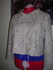
I settled on making the stripes in the "shell" go horizontal and the metallic stripe goes up toward my right shoulder, instead of the way it is in the previous close-up. The buttons are a little oddly paced in this pic because I had just pinned them on. Now I have sewed them on but I was too lazy to put the finished jacket back on Rose.
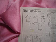
While I am prewashing some oatmeal coloured wool for a skirt, I am going to quickly sew up another top in some silk charmeuse. I love silk next to my skin and have decided to have a few tops to be worn under a jacket. Since it is so small, and since I have modified the pattern, it only takes one meter to make, as long as the fabric is at least 112 cm wide. It's a squeaker!
14 comments:
I like the second button down of the three (I think you called it the large, gold button). It stands out just enough to be noticeable, but not so much that it's tacky. Very classy.
Great looking jacket - but, then all your garments are always so beautifully made!
Julia, hope I am not too late to put in my vote. I like the shiny gold, second from the top. It just looks perfect, really classy and not distracting from the jacket. It enhances it, I think.
You have done so much sewing since I last visited. Love the embroidered linen jacket and love the buttons too. Very very nice.
Heather
Another vote for the 2nd one from the top - I really enjoy checking in to see the progress on your projects. They're so well done.
I have to add a vote for the large gold button. When I look at the three photos on the same screen, the top catches my attention in a not-good way; the bottom (small gold) looks at first like a smudge, being so similar in color to the fabric. The middle photo looks distinctive without being tacky.
I like the shiny brown. But don't trust me on stuff like that.
I would buy a bigger button. The current look is for big buttons and I think one BIG one would look fabulous on the jacket. It could be as big as 2" across. But the actual size would depend on your bone structure. Go as big as you can without overwhelming you. Keep it earthy and not shiny. Use a snap to actually close the jacket. Then you don't need a button hole and you can take the button off when the look passes!! (double win.
But of course, if you want to use one you have , or don't like the current look, choose the one that sings to you the most. BTW, the jacket is lovely :)
I liked the small gold one!
I must say I like the look of the small gold one. It seems like a classic look for a classic jacket. I think I would be constantly distracted, thinking that I had dribbled something on myself if I had a great shiny thing right there.
Of course, without seeing them really close up I can't comment on the actual button :-)
Upper right (gold spiral). See how decisive I am with YOUR buttons? When it comes to MY buttons, I have to get Darrell to choose.
Upon further examination, I see "upper right" is also known as "smaller gold." Just in case there's any confusion as to what I'm voting for.
Middle one gets my vote, although I was tempted to go with the bottom one (small spiral).
Just one more thing (because I forgot to check e-mail follow ups) - I really don't like the big shiny one and I'm now glad I didn't choose the small spiral.
Middle one - in case you're still tallying votes.
Unless this jacket closes with only one button at the top, in which case One Big button, as Vicki suggests, would be nice.
I vote for smaller gold, closely followed by the larger gold.
Post a Comment